

Picking the right picture frame colours for your child's room is that last little bit of magic that ties everything together. It’s what turns four walls into their own personal little world. The trick is to choose colours that work with the artwork and the room itself, not against them. A simple frame can make a treasured family photo or your little one's first masterpiece feel right at home.
A Colourful Welcome to Your Child's World
Decorating a nursery or a child's room is one of those projects fuelled by pure love and excitement. The right picture frames are so much more than just a border for a picture—they’re the final flourish that makes the whole space come alive. They protect precious memories and add bags of personality and warmth. Think of each frame as a tiny storyteller, showcasing the moments and art that make up your child's world.
This guide is for parents who want to create a beautiful, cohesive room without any of the guesswork. We'll walk you through some simple, practical ways to choose colours that just feel right, turning a potentially tricky task into a joyful part of nesting.
What You Will Learn
Our goal is to make this whole process fun and inspiring, so you can feel confident in your choices. Forget complicated design rules and stress; we’re here to help you:
- Understand the basics: Learn how to use frame colours to make a piece of art pop, blend in seamlessly, or tie the room's whole theme together.
- Match popular themes: Get ideas for frames that perfectly suit popular styles like Scandi, Jungle, and Nautical.
- Create stunning gallery walls: Discover simple tips for mixing and matching frames for a display that looks effortlessly stylish.
- Choose with confidence: Find age-appropriate and gender-neutral options that will grow right along with your child.
At the end of the day, the goal is to create a room that both you and your child will absolutely love. The right frames can transform the walls into a vibrant tapestry of memories, imagination, and joy.
Let’s start this colourful adventure together and find the perfect frames to complete your child's special space.
How to Choose the Right Frame Colour
Picking the perfect frame colour can feel like a huge decision when you’re decorating your child’s room, but it doesn’t have to be a headache. It really just comes down to three simple, creative approaches. Think of it less like following strict design rules and more like choosing a fun outfit for your favourite piece of art.
Let’s break these ideas down with some parent-friendly analogies. By the end, you'll have a clear framework for making confident choices that bring your child's space to life.
Create Playful Contrast
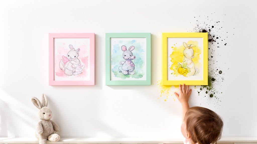
First up is the method for making your artwork the undeniable star of the show. Playful contrast is when you choose a frame colour that stands out boldly against the art. It’s like using a bright yellow highlighter on an important sentence—your eyes are immediately drawn to it.
Imagine you have one of your child's soft, pastel drawings. Placing it in a crisp black or a deep navy frame creates a striking border that makes the gentle colours inside truly pop. This technique works wonders for making a statement and adding a punch of energy to the wall.
Find a Harmonious Pairing
Next, you can aim for a more seamless, coordinated look. Harmonious pairing is like finding the perfect dance partner for your art; the frame and the print move together beautifully. Instead of standing out, the frame complements a key colour or element within the picture itself.
For example, if you have a charming woodland animal print with earthy greens and browns, a natural oak or pine frame is a perfect match. The wood tones echo the nature theme in the art, creating an organic and cohesive feel. This method is fantastic for tying the frame directly to the artwork for a polished, intentional look.
This approach is less about making the frame invisible and more about creating a unified story. The frame becomes a natural extension of the art, enhancing its theme and mood without stealing the spotlight.
Embrace Tonal Harmony
Finally, there’s the subtle art of tonal harmony. This is all about creating a calm, layered, and sophisticated look. Here, you choose a frame colour that is just a few shades lighter or darker than either the main colour in the artwork or the wall it’s hanging on.
Think of a soft blue watercolour print. Framing it in a slightly paler blue or a gentle off-white creates a dreamy, serene effect. Similarly, a white frame on a white wall gives the artwork a 'floating' appearance that feels modern and clean. It’s a beautifully understated way to let the art breathe while still giving it a finished edge.
Matching Frames to Popular Nursery Themes
All the theory in the world is great, but choosing the right picture frame colour only really clicks when you see it in action. So, let’s leave the abstract behind and look at how different frames can bring some of the most-loved nursery themes to life. Think of this as your practical lookbook, designed to spark a bit of inspiration and make your final choice feel easy and fun.
Your child’s room theme sets the stage for their own little world, and the right frames are the finishing touch that pulls the whole story together. A great frame doesn’t just hold a picture; it makes the entire space feel complete.
Scandinavian Serenity
The Scandi theme is a parent favourite for a reason. It’s all about creating a calm, clean, and minimalist retreat using a soft, neutral palette and plenty of natural textures. To keep that serene atmosphere flowing, the best frame colours are just as understated.
- White Frames: A crisp white frame is the quintessential Scandi choice. It blends right in with light-coloured walls, making the art almost float and keeping everything feeling bright and airy.
- Light Natural Wood: Frames made from woods like pine, ash, or light oak add just the right amount of organic warmth without cluttering the minimalist vibe. The natural grain introduces a subtle texture that’s so central to Scandinavian design.
- Soft Grey Frames: For something a little different, a light grey frame offers a gentle alternative to white. It adds a hint of depth while keeping things soft and muted.
Jungle and Safari Adventures
If you’re creating a room that’s buzzing with energy and imagination, a Jungle or Safari theme is a fantastic choice. These spaces are usually filled with vibrant greens, earthy tones, and playful animal prints. The right frames can really amplify that sense of adventure.
Natural wood and bamboo are perfect here, as they connect directly to the wild theme. A subtle green frame can also work beautifully, picking up on the foliage in the artwork to tie the whole look together.
For even more ideas on creating the perfect wild retreat, check out our guide on how to design beautiful animal print nurseries.
This simple decision tree can help you quickly narrow down whether you want to create contrast, match the art, or coordinate with your wall colour.
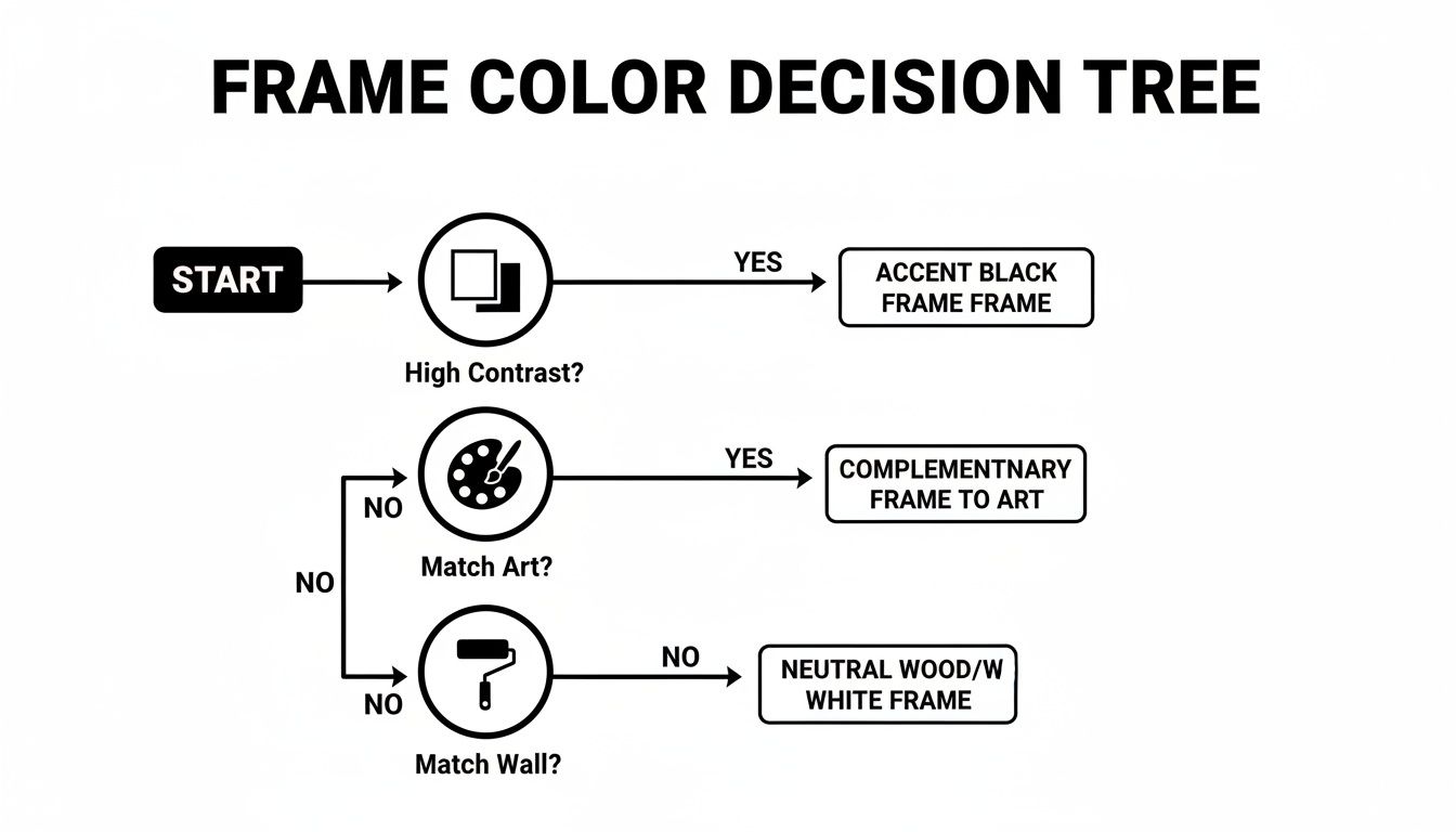
As the chart shows, your main goal—whether it's making the art pop or creating a harmonious blend—is the best place to start.
Nautical and Coastal Charm
A Nautical theme brings a timeless, breezy feel to a nursery, making you think of seaside calm and classic style. The colour palette is crisp and clean, usually centred around blues, whites, and sandy neutrals.
To capture that charming coastal feel, think about frames that mimic the colours and textures of the seaside. Crisp white frames feel fresh and bright, while a deep navy blue adds a touch of classic maritime elegance. Weathered or distressed wood frames can also be a wonderful choice, suggesting the rustic look of driftwood found on a beach.
Delicate Watercolour Prints
Watercolour art, with its soft edges and gentle hues, brings such a dreamy, artistic quality to a child's room. Because the artwork itself is often quite delicate, the frame needs to support it without stealing the show.
A thin, simple frame is usually your best bet. White is a go-to choice as it provides a clean border that lets the soft colours shine. For a little touch of elegance, a thin gold or silver metallic frame can add a bit of sparkle, beautifully complementing the ethereal nature of the paintings. Another lovely idea is to pick a frame in a colour pulled from a minor shade in the artwork itself—it creates a truly custom and cohesive look.
More Than Colour: Frame Materials and Finishes
Choosing the perfect picture frame colour is a huge step, but the story doesn't end there. The material and finish of a frame add a whole new layer of texture, warmth, and personality to a room. Think of it like choosing between a cosy wool jumper and a sleek raincoat—both keep you warm, but they create entirely different feelings.
In a child's room, this choice is about more than just style; it’s also about durability and safety. The right material can ground a theme, add a touch of magic, or simply stand up to the playful energy of your little one.
The Warmth of Natural Wood
Natural wood finishes are a timeless choice, bringing an instant sense of warmth and calm into nurseries and kids' rooms.
Frames in light woods like oak or pine are perfect for rustic, boho, or Scandi themes. They add an organic, gentle touch that connects the room to nature. The subtle grain adds texture without overwhelming the artwork, making it a versatile option that pairs beautifully with almost any print.
Given its popularity, wood is a big deal in the UK frame market. In 2024 alone, the UK imported wooden frames valued at US$68.94 million. A huge slice of this supply, over 69%, comes from China, which affects the availability and prices of many popular styles you see in the shops.
The Possibilities of Painted and Metallic Finishes
Painted wood opens up an entire world of creative possibilities. A matte black frame can provide a modern, graphic pop against a light wall, making colourful art the undeniable star of the show.
Meanwhile, soft whites, greys, and pastels create that dreamy, traditional feel many parents love for a classic nursery.
For a little extra sparkle, don't overlook metallic finishes. A brushed gold or sleek silver frame can elevate the decor and add a touch of magic, perfect for framing a special quote or a delicate watercolour print. These finishes catch the light beautifully and can make a simple gallery wall feel extra special.
Most importantly, when choosing any frame for a child's room, prioritise safety. Look for sturdy frames with non-toxic, child-safe finishes and secure backings. For a range of safe and stylish options, you can explore the collection of beautiful picture frames at Pompom Prints that are perfect for nurseries. This ensures your beautiful decor is also practical and worry-free for your little one’s space.
How to Create the Perfect Kids Gallery Wall
A gallery wall is such a brilliant way to tell a story, turning a blank space into a focal point buzzing with your child’s personality. While it might sound like a big, scary design project, pulling together a stunning display is much simpler than you think. It really just comes down to picking one of two easy-to-follow approaches.
Let’s break it down and give you the confidence to create a gallery wall that you and your little one will absolutely adore for years to come.
The Unified and Serene Approach
For a calm, organised, and beautifully cohesive look, the unified style is your best friend. This is all about using picture frames that are the same colour and, often, the same size. Picture a neat grid of nine identical white frames, each holding a different family photo or a piece from a matching art set.
This approach creates a clean, intentional display that feels wonderfully serene and uncluttered. It’s perfect if you love a minimalist or traditional aesthetic, as it brings a real sense of order to the wall and lets the artwork inside the frames do all the talking.
The Eclectic and Playful Mix
If you prefer a style that’s a bit more dynamic and personal, then an eclectic gallery wall is a fantastic choice. The goal here is to blend different frame colours, materials, and sizes in a way that looks thoughtfully curated rather than chaotic. The secret is finding a common thread that ties it all together.
Here’s how to master the mix:
- Limit your colour palette: Don’t go wild. Stick to just two or three frame colours. For instance, you could mix natural wood with white frames, then add just one or two pops of a single accent colour like soft blue or sunny yellow.
- Use consistent matting: This is a game-changer. Placing a white or off-white mat inside each frame, no matter its colour or style, creates a unified look that makes the whole collection feel cohesive.
- Balance the layout: Mix large and small frames, but make sure to distribute them evenly across the wall. This stops one side from feeling visually heavier than the other.
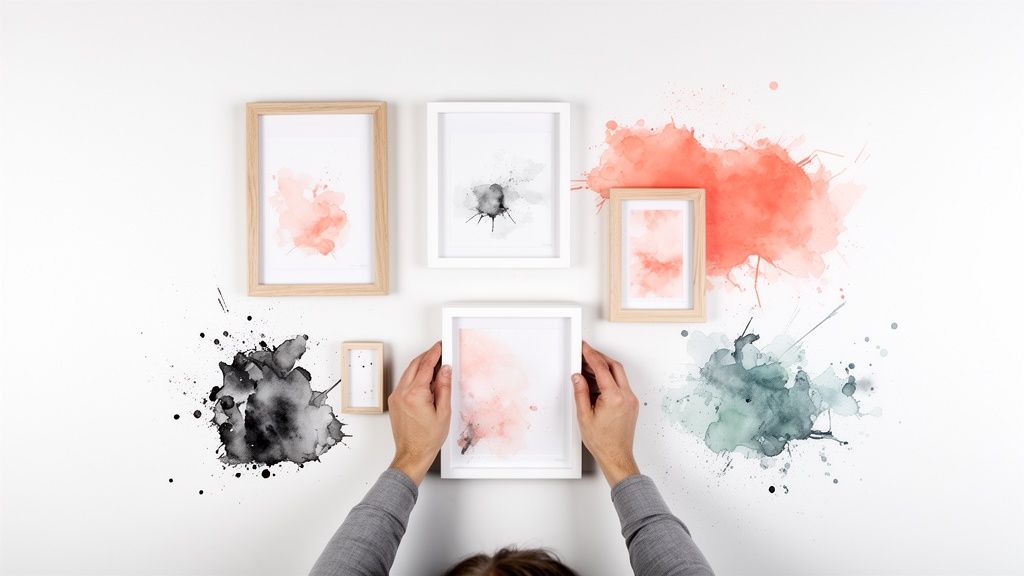
No matter which style you choose, here’s a tip that guarantees success: plan your layout on the floor first. Arrange and rearrange the frames until you’re happy with the composition before you put a single nail in the wall. You can even trace each frame onto paper, cut out the shapes, and tape them to the wall to really visualise the final result.
For more inspiration on arranging your prints, you can also explore our tips on creating beautiful nursery wall art.
Your Guide to Picture Perfect Memories
So there we have it. Choosing the right picture frame colours is about so much more than just decorating – it's about turning a room into a space that tells your family's story. We’ve looked at how simple ideas like contrast and tonal harmony can make your child's favourite artwork really pop, and how different materials and finishes can add that extra layer of personality to their special space.
Whether you're planning a beautiful gallery wall or picking the perfect frames to match a nursery theme, you now have all the tools you need. The most important thing to remember? There are no hard and fast rules. There’s only what brings you and your child joy. Trust your instincts, have fun with it, and don't be afraid to experiment.
This focus on creating truly personal spaces is something we’re seeing more and more in home décor. In fact, industry analysts estimate the UK picture frame market will grow at roughly 3.6% CAGR between 2022 and 2030, showing just how much we all love making our homes unique. You can discover more insights about the UK picture frame market if you fancy a deeper dive.
The best-decorated rooms are those filled with love, not just perfectly coordinated items. Your choices will help create a backdrop for countless precious moments.
With these ideas in your back pocket, you can confidently choose frames that will turn your child's room into a cherished little retreat, one filled with creativity and happy memories. You’re all set to create picture-perfect moments that will last a lifetime.
Common Questions About Choosing Frame Colours
Even with the best advice, a few little questions always seem to pop up right when you’re about to make the final decision. Decorating your child's room should be fun, not stressful, so we've pulled together some quick, clear answers to the queries we hear most often from parents. Think of this as your final confidence boost before you get those frames up on the wall.
What Are the Best Gender-Neutral Picture Frame Colours?
If you’re aiming for a timeless space that grows with your child, you can’t go wrong with gender-neutral colours. Classics like a crisp white, a soft grey, or a natural wood finish are incredibly versatile. They create a calm, beautiful backdrop that lets the artwork itself do all the talking.
There’s a practical side to this, too. Frames in these adaptable shades can easily be moved to other rooms or repurposed for new décor as your little one’s tastes and favourite colours change over the years.
How Do I Frame My Child's Own Artwork?
There’s nothing quite like framing your little one’s masterpieces to show them just how much you cherish their imagination. For those wonderfully busy and colourful drawings, a simple white or black frame is often the perfect choice. It acts like a clean, crisp border that makes their art the hero, without competing for attention.
Another brilliant little trick is to pick out a secondary, less dominant colour from their drawing and find a frame in that exact shade. This creates a really thoughtful, custom look that feels extra special and shows just how much care you’ve put into displaying their work.
What Frame Colours Work Best in a Small Nursery?
In a smaller nursery, the goal is to make the space feel as bright, open, and airy as you can. Light-coloured picture frames are your best friend here.
Look for frames in shades of white, off-white, or a light-washed wood finish. These will blend almost seamlessly with pale walls, creating an illusion of space and light. It’s best to steer clear of anything heavy, dark, or overly ornate, as those styles can visually shrink the room and make it feel a bit cluttered.
A gallery wall made up of slim, light-coloured frames can add a huge amount of personality to a small room without ever making the space feel crowded or overwhelming.
Can I Mix Metal and Wood Frames on a Gallery Wall?
Absolutely! Mixing materials like metal and wood is a fantastic way to create a stylish, modern gallery wall that’s full of character. The secret to getting it right is to find a common thread that ties the whole collection together, so it looks intentionally curated rather than chaotic.
You could, for example, pair warm-toned wood frames with brushed gold or brass frames for a cosy, sophisticated vibe. Or, for a slightly more industrial feel, try mixing black painted wood frames with thin black metal ones. To keep the whole display looking polished, use all-white mounts inside every frame or stick to a consistent colour palette within the artwork itself.
Ready to bring your child's room to life with the perfect prints? Explore the beautiful and unique collections at Pompom Prints and find the ideal art to fill your new frames. https://pompomprints.com